Why is everyone using the free plan?
Hi, my product https://obeatow.com has slowed down on signups with no users, and https://twayobiz.com has several users, but only one paying user.
-
Why could my older SaaS Twayobiz have nearly 200 signups, but only some using it and only one paying customer - essentially $15/mo right now
-
Why do my Product Hunt launches only get 25 upvotes max (a bit off-topic)
Am I doing something wrong? Been trying to do this for almost 5 years now with no success.
Update: Lots of debate on the graphics. Good news, just launched our new landing page.
Before: 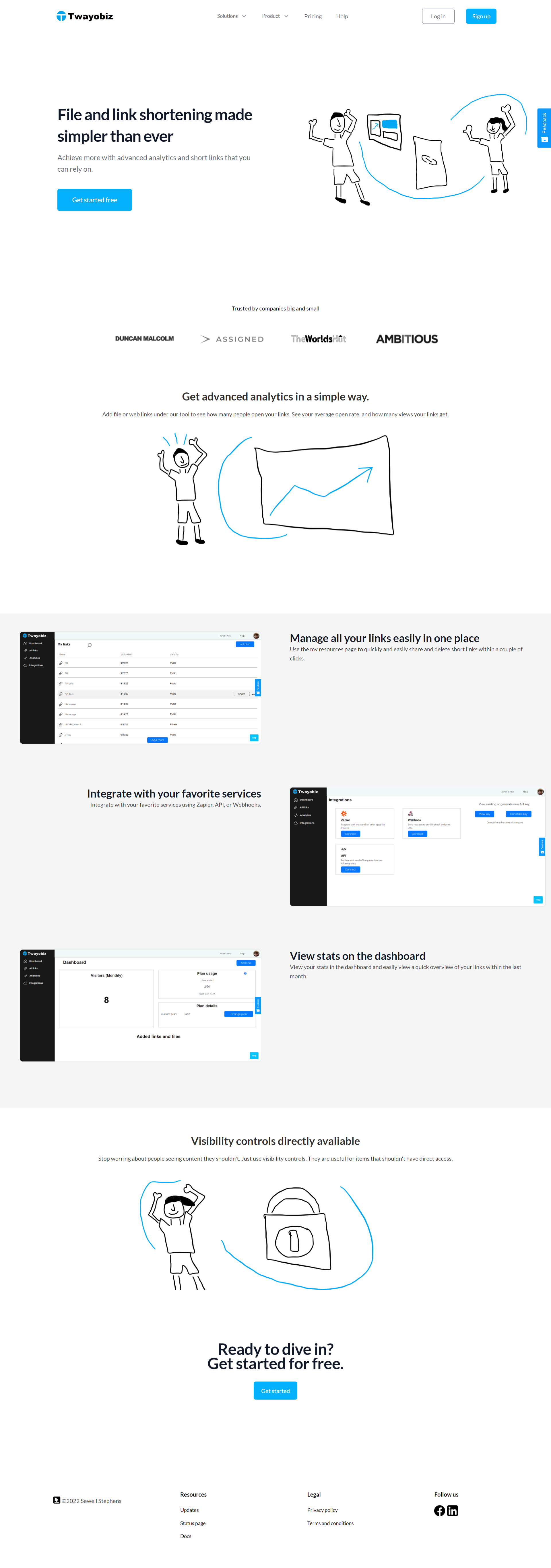
After: 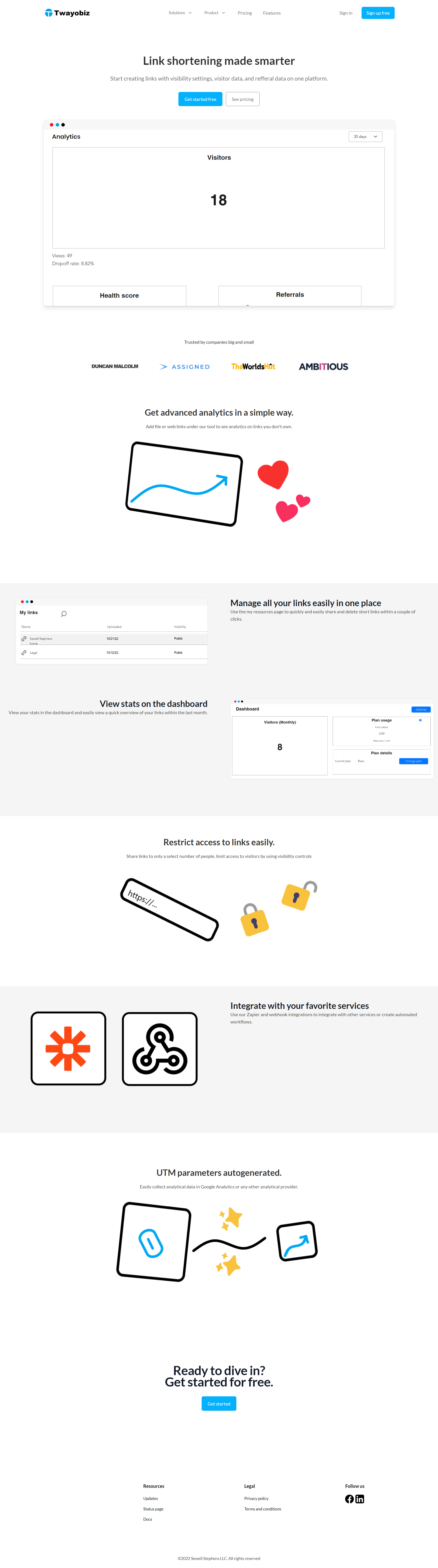
Did I do a good job updating it?
Trending on Indie Hackers

https://twayobiz.com/ pretty much looks like an unfinished product. Of the links that are in the top navigation only a few actually work. Enterprise and premium support are dead links, features are dead too. From the home page it's hard to understand what is better about twayobiz compared to others. Also, I can't remember the name. On the pricing page you mention features that haven't been explained elsewhere.
https://obeatow.com/ has an image on the home page that is broken. It's the first image everyone could see and it does not work. That's already a turn off. Most of the links in the top navigation on this site are dead too..
My overall recommendation would be to:
Good luck!
Switch names to something remotely memorable -> My site names are really hard to come up with as Its hard to find names that have less than 10,000 results already on them. Heck, if I chose a generic name, I would have to compete with a million other sites.
Either finish the missing pages... -> I just fixed the missing graphic on Obeatow. I used to use this product called Bannernote.com which used to have links like that all over the place. It was actually a great product, but their login page started acting up so I left as thats unacceptable for a SaaS product.
Finish listing features... -> What product features did I not list? I have a lot more like my custom domains feature I just released yesterday, and I don't have a screenshot of the reports/analytics page as I already mentioned it above the screenshots.
I would be more concerned If I wasn't getting a decent amount of signups from my Google Ads campaigns.
And I am accepting criticism as business owners who don't dont know that they're doing do that garbage. Just don't expect my to implement everything suggested.
To be honest... the Microsoft paint pictures got to go.
What about https://notion.so? They have even worse graphics. Mine are top-notch compared to that.
Unfortunately, those paints look really unprofessional. I would say the same.
They're as modern and simple as they get, unless you talking about Notions
The images on notion are professional, are detailed, match the theme of the site. Your images are chaotic, lack precision and clearly stand out enough so that people comment on them. If multiple people mention this as a negative, maybe hear the wisdom in that.
Heres one that looks closer to mine: https://brutask.com
No, they don't.
Look, I know I got stuff to do and you do to. I'm not just going to fight all day. I'll try to throw some different graphics in there, but I can't guarentee it's going to happen as soon as you may like.
I'll try to say this not to aggressively, but have no idea what all this sh*t is about, but I see simplicity in those images I made and i guess that wasn't enough. It's like everyone has something to say about everything.
you asked for feedback. there it is
@luceos, @gorkemcetin, plus others and you, the graphics are you hated our gone and replaced with screenshots. you'll see when you visit https://twayobiz.com and https://obeatow.com
This comment was deleted 2 years ago.
I think the main issue here is that a lot of people say the same, yet those don't mean anything to you. Wish you all the best!
That comment was actually supposed to go up there ^
This comment was deleted 2 years ago.
Had the same experience as the other commenters, sites are broken and look unfinished. And well, link shortener? There's so much competition and I haven't used one in years. And the other one..captures form data before it was submitted? I consent to publishing when I click submit; there are privacy concerns (GDPR etc). It's just not a good idea IMO.
Mine is more than just your average link shortener. Great statistics, Visibility controls like no one else, more for your money essentially.
I looked into that already. Web scraping is totally legal if done with consent. Thats why you never run third-party code without consent first.
Are those your final graphics? Looks like it was done in MS Paint in 10 seconds.
As I said up there what about https://notion.so? They have even worse graphics. Mine are top-notch compared to that. Its really hard for me to make graphics that look good as I'm stuck with Paint 3d on Windows 11
Notion graphics looks great.
Did you go to the url? I totally think Notion is just keeping their landing page in the past and their competitor Coda doesn't get any credit for some reason. Like Codas site might not look amazing either, but at least they keep everything updated.
I'm not trying to start a fight, besides, just like you have stuff to do I do to so have a good rest of your day.
Notion got 3 million views a month, maybe they are doing something right, lol.
for real LMAO
Well, they probably spent money on marketing as any other company does through something called Google Ads. I run ads on Google Ads, but you have to see they have a bigger budget than me. These are just side projects, and as you can tell from the post, not sustainable.
Plus they have a big user base already so thats something else you have to see.
Here's a new link shortener that did its best to stand out, promote itself in a professional way with excellent graphics and by clearly conveying the USP's. This might give you some inspiration on how to market your own product in a heavily saturated market:
I'm not affiliated with LinkDrip by @SimonHoiberg, I just think he did a great job.
Thanks for the mention 🙌
Should I just switch back to my old landing page design at this point back in 2021 when I just did file sharing, but change the headline, and edit graphic a tad bit?
This comment was deleted 8 months ago.
https://63504f96fd24490281eb2df2--twayobizland.netlify.app/
Even better update: https://twayobiz.com. Sucks that those graphics were so hated. I thought they represented the brand perfectly
I agree with what has already been said. Both products look like they are unfinished and several things are not working on both websites. Therefore, I do not trust the product and would not pay.
Not working? You can log in/sign up no problem, You can create links as long as you have enough usage. I've tested everything.
On the Obeatow site, the top link "Why Obeatow" is not working. On the other site, any of the "product" links in the dropdown menu is not working.
The top menu is the most improtant part of your website. If those links don't work, people lose trust in the whole product.
You asked for feedback so we are giving it :-).
With regards to the graphics: you are comparing your graphics to the ones on notion.so. Yes, you both have the same style, but within a style there is of course variation in the quality. I have to agree that yours look like they have been done in Paint in 2 minutes while the Notion graphics are more "layered".
This image explains our comments perfectly: https://i.snipboard.io/u64hxQ.jpg both sides represent a horse but one is more finished than the other.
I just looked at the image. At least my graphics aren't that bad. I can see if I can throw some new graphics in, but it's not going to happen instantly. I don't see what's so terrible about my graphics and I know the lines aren't maybe as professional as you'd like, but I felt since they looked nice, simple, and modern, that would be enough.
As we know, in business, simplicity is king.
As someone visiting this website for the first time, the illustrations turn me away almost immediately. I've seen some of the sites you linked that have "poor illustrations", but they are a specific art style rather than poorly drawn MS Paint doodles.
I'm not trying to offend you by any means. I know that last sentence sounds rude - I am trying to give honest feedback.
I would say maybe looking into some cheap talent on Fiverr or something to help design some images. They don't have to be perfect. They can be a minimalist art style, but the MS Paint ones make the product lose credibility.
I was never offended, I just frustrated, because ideally I would be able to make graphics like that that were good. Like, maybe I should switch back to the late 2021 version back when I only did file sharing, at least the feedback on that version was at least decent:
I've spent lots of money on Google Ads on the site I had right now, and it would of been nice if I had known this landing page redesign was so bad a while ago as I put way more than 10 seconds into it, and I guess thats what it looks like.
Because before investing amount they check is this product has worth paying!
if they feel this product is good and then they select the other plan!
This comment was deleted 8 months ago.
No I don't like most of the advice, but at this point I'm going to have to change something. I thought the graphics would be fine, like who doesn't like modern colors and simplicity aside from old people 😐. Like I used two colors that go amazing together and don't look bland or outdated.
Since the landing page is so hated, here's a new one that's awaiting feedback: https://63504f96fd24490281eb2df2--twayobizland.netlify.app/
This comment was deleted 8 months ago.
Hi, those pages don't exist yet. That's why when you click the link, it adds that # symbol to the url. I've had it like that for several months, and ran some Google Ads. I changing the graphics to your liking, but not everything unfortunately 😕
This comment was deleted 8 months ago.
Even better update deployed: https://twayobiz.com